In this article I’ll discuss an experimental redesign of a fashion product page from Uniqlo Japan’s online shopping website. I imagined how the site would be like a couple of years from now. View the demo

I’ve been wearing American Apparel T-shirts for years and recently switched to Uniqlo when I was finally able to fit into a Japanese size L after losing weight. Uniqlo is much cheaper than AA and I can just buy them in town than pay shipping fees. Uniqlo also seems to be a more innovative company. My wife and I wore their ultra-thin but surprisingly warm Heattech range when we were in Seoul in winter December last year.
Unfortunately they don’t offer online shopping in Singapore. I looked at its Japanese shopping site and then had the idea of imagining how e-commerce would look like a few years from now. Today’s typical e-commerce product page is simply a brochure with an add-to-cart button. This is understandably optimal for sundries but I want to try to make shops like Uniqlo’s more emotionally engaging. At the same time improving the user experience across devices.
This article documents my attempt at designing the next Uniqlo product page based on the following industry trends and reasonable assumptions about the future.
- Online shopping is increasingly being done on mobile devices
- Internet connection speeds are increasing
- Screens are going to get bigger and will have higher pixel density
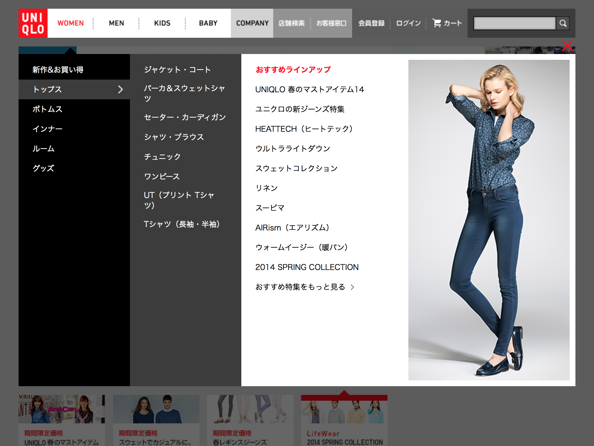
I’ve kept the existing information architecture because I don’t think I’m in a position to add or change features being an outsider. This would be a purely user interfacial exercise.
Here’s what the current product page looks like:

I took this screenshot on a 15-inch MacBook Pro with 1440×900 resolution, a fairly typical laptop spec. The fixed width layout causes considerable waste of space which becomes more apparent as you scroll down the page.

While usable on tablets albeit with smaller than optimal tap targets, it’s not optimized for smaller mobile devices.
It’s also surprising that they aren’t using web fonts but old-school image replacement for text in their corporate typeface. The US site is the only one that uses web fonts. The result is blurry text, especially in high pixel density screens like the Retina display.
Redesign strategy
- Fluid layout to make efficient use of available screen real estate and increase the quantity and fidelity of information above the fold
- Responsive CSS to adapt a single markup to all screen sizes from the phone to large desktop displays
- Use space more effectively when viewing product photographs
- Logical grouping of related information and actions
- Crisp and sharp text rendered with web fonts
- Bigger touch screen friendly tap targets
- General usability improvements
Adaptive (fluid + responsive) layout
I’m extending Bootstrap’s responsive utilities and grid system. Bootstrap handles screen sizes from XS (phone) to L (desktop monitors). I added an XL size to accomodate very big screens like the Thunderbolt display.
The convention when it comes to designing responsive sites is the mobile-first approach. This is how Bootstrap does responsive. The base styles are for small devices and media queries are added to vary the styling for bigger screens.

At phone size, the interface is compact and simplified. The lengthy product description is hidden behind a toggle so the product image is visible. The text and UI elements are smaller. The shopping cart is simplified into an icon. At portrait view the add-to-cart button is visible to ensure conversion is optimal. The product options (visible in later screenshots) wraps below the main column.

A tablet size, more information surfaces. With the tablet at landscape orientation, the product description is expanded, social sharing buttons are exposed and product configuration are shown as a sidebar. The shopping cart also shows number of items in the cart and the total value. The UI elements and text also grows.
At laptop size, related items become visible. UI elements and text grows even bigger. The product is displayed in its full glory.

At the biggest size, I decided to not cram in more information but instead just make the text and elements bigger. It’s more like a zoomed-in laptop size.
Fullscreen product photos


Instead of a pannable image viewer opened from thumbnails, in the original design, my design has little zoom here buttons. For example the user can click on the zoom button at the collar to examine the collar. A fullscreen image viewer pops up. It feels like you took the clothing off the rack and you are looking closely at it.
Clothing tag

I’ve grouped all product configuration options in the sidebar which I named .clothing-tag because I want to feel like the real life counterpart. What do you do after you check out the clothing design? You would usually reach for the tag to look at the price and other information about the item.
General usability improvements
- The quantity selection dropdown has been replaced by an
.input-groupfrom Bootstrap. It takes lesser clicks if you are just want to add a couple of pieces. On mobile, dropdown boxes are a pain to operate. It’s much easier to just tap a button a few times. - Add-to-cart button that’s bigger and not hidden further down the page.
- Transitions when zoom here buttons appear and when looking at larger photos so it’s less jarring.
Where are the breadcrumbs?
Imagine yourself shopping at Uniqlo. If you’ve never seen a Uniqlo store, they all look similar and feel a lot like IKEA.

Physical stores have no concept of breadcrumbs, only racks after racks of laterally arranged merchandise. You know you are in the sweater section because that’s what you see around you. You know you’d find other women’s stuff because the women’s stuff are all grouped and separated from men and children areas. You subconsciously wander the shop and visually look for what you need. Shopping is visual, not navigational.

Right beneath the product are adjacent items in the same category. At the end of that list is a view all knit wear and sweaters option. If you don’t like a product and you’ve scrolled past the product, you don’t have to scroll back up to access the breadcrumbs. The adjacent items are right there and if something catches your fancy, click it else you may look at all the products in that category by going to the category page. If you decide to buy a different kind of clothing, only then you scroll up and go back to the women’s section.
Uniqlo’s main navigation which I have not redesigned is a giant column-based hierarchical menu system. It’s an effective way to browse to other parts of the store. By designing the core interface well, generic components like breadcrumbs can be avoided to make room for a visually richer shopping experience.
It’s important for a brand like Uniqlo with a distinct image to reflect its brand aesthetic to its online store.
I want to mention that Photoshop was not used in the redesign. Bootstrap’s grid system is itself a great design tool and I composed directly in code. The basis of responsive and adaptive layouts are relative dimensions and the spatial relationship between UI elements. Photoshop forces you into one-dimensional thinking with pixels. Making multiple mockups also feels like a waste of time. I’d prefer to design in code as rapidly as I can and a framework like Bootstrap, along with tools like LESS and Sass allow just that.
The source code is available in my public Github repo. You should look at the base stylesheet, the markup and the layout. If you’d like, here’s the demo page again.
What are the best online shopping experiences you’ve seen?